Tuesday 14 April 2015

Contents page

Contents page + what to include in my magazine ideas:

-Paris and New York fashion week
-Beauty tips
-High street shops
-Famous models secrets
-New in trends
-Runway looks
-create cheaper looks similar to those from Vogue or Elle
-the best from fashion designers
-Makeup
-Accessories
-Spring clothing


Examples of some fashion magazine contents pages:


These two examples are from Vogue magazines and they are both very similar, the images are both located to the left of the page and some of the word Vogue covers the image. Both left pages also have an image which has a grey background, this has shadows and highlights in places. So they normally lay out the contents page in a similar way for each issue, and this is to position the image to the left of the page. I have also noticed that the colours of the text used is mainly black and red for titles of information, so this stands out from the black which viewers may not have read.


I have noticed in some issues if the contents page is not a double spread, then the page next to it is a large image filling the whole page. I may choose to do this in my magazine because I think this is a very good idea to complement the text on the next page.


Other magazines like these (Elle, Cosmopolitan) have a lot more writing on there contents page with smaller images but seem to have more images around the edges of the pages, whereas Vogue use one big image to the left of the page. They also use a lot more bright colours with thicker and bolder text.


I really like this contents page by Bazaar because I like the header font type and the change in font and size of the word 'contents'. I also like the way the page has been divided using lines and this underlines the headers for each section.


Using this inspiration I think for my contents page I will use a double page and use a landscape image from my photo shoot and have most of the image to the right of the page and more free space to the left which can be filled with the writing and information for the content of the magazine.


Magazine name
I have chosen to name my magazine 'MATTE' because I think it relates to young people and it is in fashion to use matt colours for example makeup like matte foundation or matte nail varnish. Also the name at first glance you may think it says mate, so this could be related as the magazine could be a friend to a reader as it would give tips and advice.


Focus group

Focus group                                                          

The questions I will ask my focus group of around 6 people from 16-18 year olds, I will also aim to ask a female who is in their twenties, this would then be used to compare the two age groups and will be interesting if both say similar or different responses.

Questions
1 - Do you like the choice of font on this vogue magazine? and also my made example?
2- What colours are you interested in for a background/font colour?
3- What fonts don't you like?
4- What makes a front cover of a fashion magazine appealing to you?
5- What would you like to find in a fashion magazine?
6- Do you prefer models or celebrities on the cover as the main image?
7- Or do you prefer to see ordinary people who are not covered in makeup and who doesn't look 'perfect'? -This would mean it looks like them so it reflects the audience and also relates to them.
8- What are your first impressions of this vogue magazine, and my first plan cover?
9- what do you like and not like about them?
10- Do you like this simple lay out?


Answers:

Freya aged 16
1- Yes, I really like this front cover as I really like this model Jourdan Dunn, I have seen her before in other modelling and many clothes look good on her and suits her.
The high key lighting on face brings out feminine features, especially check bones.
l like the spring theme of colours, which is green and orange with white this all works together and also gives a summery feeling.

2- I like light grey tones on a background, I also love matt colours because it gives a nice background. however this means it wouldn't be shiny as normal magazine covers are.
I like white coloured font as it is bright and stands out against strong backgrounds. 
I would also like to see a tone of red against a grey strong coloured background.  

3- I  don't like the text it is too chunky and thick and not suitable for fashion magazines, as this makes them look boring and too simple. However I like font
like capitalised  you have used for your masthead and also the font Vogue has used this looks stylish. I don't like the font too curvy and joined up it looks too much like handwriting.

4- I like the text to be bold so it stands out. The images need to be strong and complimented by the colours. Also I think for a fashion magazine it needs to look sophisticated, so not too much going on or huge blocks of colour like other magazines use.

5- I would like to find the latest trends and to be up to date with fashion at that current time or month.  I would like to see celebrities and models, so I can see what is popular and in at this season. I like the idea of make up tips in the magazine because it gives new ideas which I have never tried before.
I would also like to see models wearing the clothes from high street shops so can see the clothing on and see what goes together, because its hard finding different clothing with no ideas of what I want to get. 
inspired by this
shops high street prices


6- I prefer to see models on the cover  because it makes it to do with fashion and not more about gossip and there lives as it would if it was a gossip magazine. However I do like Chloe grace mortez I think she has a good fashion sense that relates to my age group.


7- Yes I would like to see normal people as it would relate to everyday people and lives instead of photo shopped models with perfect bodies and skin. But I don't know if that would be recognisable as many people recognise the cover image.


8- For your own example I am not too fond of background shade I prefer it to be darker and I don't like the contrast with her clothes.
I  do like the font and the 'O' with line through it
I like the shortening of the name instead of Chloe which is a girls name, it makes it slightly different.
I don't like yellow writing on the page, it is not very readable.
For the Vogue example with Jourdan Dunn, I really like this because the colours are bright and it has a sense of summer and warm, and it brings a sense of happiness because the nice bright weather always lightens the mood.


9- For your magazine cover example, I am not too sure about the miss in the name.


10- Yes as I don't like too complicated and highly dense writing on covers. It doesn't give a direct focal point, and I don't really know what to look at as there's too much going on.


Saturday 11 April 2015

Magazine research

Further magazine research                  

I have found another magazine called i-D which includes fashion in there magazine as well as music, culture, news and beauty.  I really like the simplicity of these magazine covers, they only have a close up image of a female portrait, these portraits all use direct address as they look at the camera which means they are looking directly at the audience. The name of the magazine is written in an unusual way compared to all other magazines, 'i-D' is always written to the left of the page either a normal upright landscape or turned 90 degrees making the text sideways down the page. These two letters are always written in a bold strong font but the colour changes, I think they choose this font colour depending on the background colour or main image. Also this magazine sometimes uses a box behind the main name text, this is filled with a chosen colour and this makes the two letters stand out a lot more. On these magazines there is one smaller word written towards the bottom of the page, these for example are words like, love, youthful, together, fresh and graceful. I really like the use of colour which is included on these covers, they look fun as well as simple but it works.


chosen option


Option 1:
 
Pre Production:
 
The front cover and a contents page for a new magazine
 
Production:
 
Two different covers for the magazine for different times of the year or a double page spread for the magazine.
 
A 1500 word report.
 

Photoshoot plan

For my magazine front page, contents page and double page spread I want to have some graphic design which links them all together, like a certain shape, or letter. I also want to use big shapes which are not filled with colour so its only the lines that can be seen, this will be big across the pages.


My Photo shoot

high key lighting
floral clothing
bright colours
strong makeup
jewellery
rule of thirds - this is a good technique especially for the front cover because it means the text can be one side and read easily. However, I do prefer the cover model to be more central to the cover this is because I have seen this used in high end magazines like Vogue and Elle.
model looking at camera- this is for direct address for viewers.


-Make up
strong black eye liner
a coloured eyeliner or eye shadow under the high for highlight
on eye lid in corner lighter and gradually gets darker to the outside of eyelid

I really like this eye shadow colour for spring, the lighter shine of white in the centre and turns to a bright turquoise and then grey.


Eye liner idea, I like that this is different to the normal line of eye liner.


I really like this light shade of peach and slightly pink lipstick, I would like to use this colour for my photo shoot.


 I also like this eye makeup which has shades of brown and grey on the outer corner and the eye liner is a thin black line.


I like strong red lips with the neutral and brown eye shadow, this makes the lips stand out powerfully.


Foundation and bronzer, I like more suttle bronzer and not too over the top as I want it to look natural. I do like the highlight on the cheeks as it emphasises her cheek bones.


I really like this overall spring look, with the pinky, peach lip colour, slightly bronzed cheeks, thin black eye liner and brown eye shadow but this seems not be light n the corners and darker to the outside, also I would like to use a bright blue eye shadow for a spring look. Also I would like the hair to be wavy.


I like her hair as its wavy and texturized, it also has a spring feeling.


Spring nail colours pastel colours are very popular for spring.


I was looking through a miss VOGUE magazine from June2013 and I really liked this image. I like how VOGUE's photo shoots are always different and they are not scared to try something new. So I would like to try something like this in my photo shoot to make it different from other fashion magazines. For example shading in colour on the eyebrows.


Photographer research


Maëlle André                     

I have found this photographer who I am inspired by for my own photo shoot for my magazine cover, I have used ideas from this in my own photo shoot. For example I used an outside setting with trees and plants, but I do want to slightly blur the background of my taken photos so it makes the focus point more of the model in foreground of the photos. This then also relates to my theme being an spring season issue.


Friday 20 March 2015

Research

Pre production


Magazine ideas:
-fashion
-hobbies
-sport
-food
-gossip
-animals
-transport
-technology

Some existing fashion magazines:
Vogue, Elle, Glamour, Bazaar, Fashion.


Different fashion magazines have different coloured titles, and many do not stick to one specific colour on all issues, a popular colour which many magazines use for their masthead is red, but others choose the colour depending on the whole cover colour. For my magazine I would use a colour which relates to the image colour. I  will not use a huge amount of colours because the magazine would begin to lose its sophisticated look and would give a feeling of being addressed to young children.
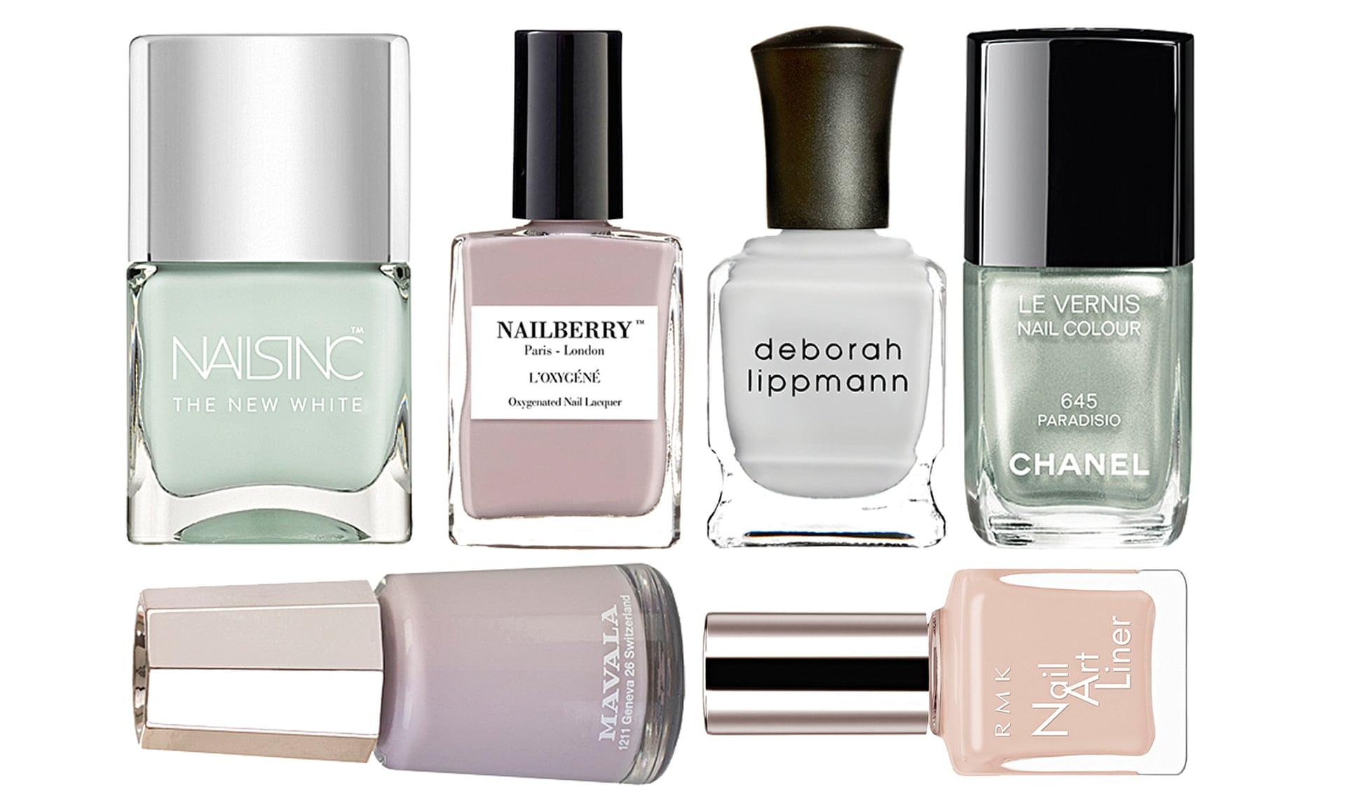
I think that a light tone of grey would fit an classy background, and text which is bright.
For example this 'Fashion' magazine has a red masthead and is against a white background, the masthead is popular but the white background isn't a familiar thing to do, however I think it works because the text colours used contrast against the background, also the models dress is a strong black. I also feel that the colours reflect the theme of the magazine, as the magazine issue is November it relates to winter and these colours suit, they also are popular colours to wear to parties and casinos. I like that I each of these examples the main image is placed directly in the centre and the model is using direct address by looking straight at the camera, this is used to draw in the audience, in a way telling them this magazine is for them. It seems that many fashion magazines use similar masthead fonts, I think this is because this font is strong and sophisticated to relates to a female audience. I really like the masthead font for the magazine 'Elle' it is simple and the letters are evenly spread, I have noticed that many of Elle magazines masthead's are in a white font, however others are strongly coloured to stand out from the background colour. I also like that the fonts are of different sizes, I would like to try this technique on my front cover.


I intend to create a glossy monthly fashion magazine which is affordable and aimed at female teenagers and young adults from 16 to 25.
My magazine will be a spring issue so will include bright colours which are strong to stand out and will contrast against a darker colour background like grey. My photo shoot will be taken when the weather is sunny as it would be high lighting so the photographs would be stronger quality, also this would relate to the spring issue theme. The text colours would relate to the clothing of the cover model. This clothing will look high end and trendy but also affordable, my ideas for clothing would be skirts, or dresses, floral patterns, bright and strong colours, high heel shoes which would probably be black.
 
I like the simplicity of high end magazines for example vogue, the layout of their magazines are very sophisticated by using only small amounts of graphics, colours, imagery and shapes.  The imagery is always very strong as photo shoots always work, the models normally have large amounts of makeup on but does not look like an  too large uncomfortable amount. This magazine is very popular so also has a teen version which is aimed at younger people called 'Miss Vogue', this is aimed at teenagers who like the main vogue magazine but are not so interested in the clothing as it is aimed at people around 20 and 30's, this age group is an age that can afford the expensive fashion, as they may not have children yet and will be very involved in their career.  I like that only simple and small amounts of images and text is used, this gives the cover a sense that it is modern and high end. As other magazines for example, cosmopolitan these covers have much going on and it is overcrowded, there is also use of strong coloured backgrounds which are blocks of yellow, pink, red or purple, this is because the magazine is aimed at females.  I prefer more spacious layouts with strong images and colours which match the main image.

Other fashion magazines like Vogue are expensive and unaffordable for a younger audience so I would like to create a magazine which any person could afford, especially teens and the fashion would be affordable, so the clothing could be high street prices like Topshop and Newlook. As vogue magazines are £4.00,  I would then want to keep the price of my magazine below £3.00. So maybe £2.50 would be a more reasonable price.


This magazine cover above left image, has much going on as the writing has taken over the photograph of the cover model this suggests that the content of the magazine is persuading the reader to buy it as it has a lot to offer and you wont be disappointed. As different fonts are used one handwriting font to give a female interest also strong black font to stand out, “one women’s fight back” this writing is slight slanted to give a range of texts on the page so it isn't just all plain text which could make the page look boring. There are also stickers in bold red colour which sums up about beauty and the sticker effect makes this writing stand out as we are drawn in to look at it from the bold colour. The main image is just a focal point to give slight interest as it is a celebrity so the magazine is going to include a lot about celebrities. This magazine also includes much about sex, this writing is in big font to stand out to the reader and it tries to persuade the reader to want to read it.                                                                                     

The masthead are mainly always used in big bold red font placed at the top of the page, this is because they want their magazine to be noticed and for usual buyers to be able to recognise it. Also when being placed on a shop shelf magazines are all stacked in front of each other so it is sometimes hard to find the magazine buyers are looking for or to notice new magazines, so the ‘Cosmopolitan’ name gives identity and can draw in female readers who are familiar with the magazine or are looking to buy a new one.                                                                                    
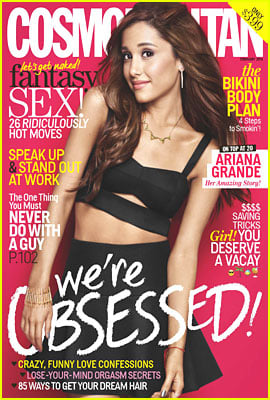
  The magazine to the right of Ariana Grande I don’t like this magazine as it looks like it is addressing a younger audience with the red background, also pink and white colours and the main image is Ariana Grande who is associated with young people’s Tv programmes, and now she is a singer. But with the use of text on the front cover it seems to change who their addressed audience to older females as it talks a lot about sexual things and suggests that you need a perfect body and this magazine will help you get it. So it may cause effects on young girls at the teen age, they may become self conscious after readying this as all the bodies shown are skinny and perfect, so they are seen as normal but other body shaped=s are then conveyed as different so it seems this magazine is saying anyone like this needs to improve their body, this could cause depression and anorexia.


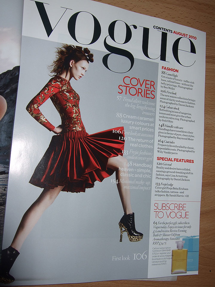
Vogue front cover analysis. I really like the colours used on this front cover of vogue magazine, the grey background gives a modern and sophisticated effect. This grey used is a light tone which doesn’t make the magazine look tacky or cheap, it fulfils the high end target audience who are looking for new fashion to be inspired by this magazine. There are many shadows around the main image which makes this model stand out conveying a strong direct address to the audience and it makes the audience look at her before reading the text which makes the audience interested in her clothing.  I also like the use of simple colours, there is only white, black and grey used on this front cover this makes the cover more appealing and it is to suggest the simplicity of the magazine as many people are put off when they see lots of writing, and the cover does not need much going on or it would ruin the 
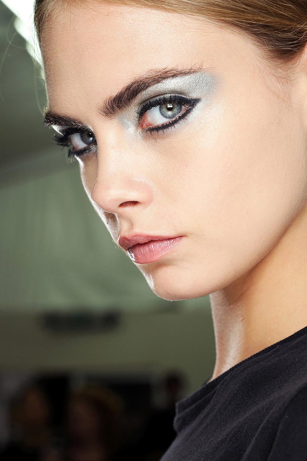
sophisticated look and would change the purpose of the magazine. The lighting used for the photo shoot of the cover model is very specific, there is high lighting on her face especially to emphasise her cheek bones and it then shadows to each side of her face and towards her chin which is highlighted with a shadow below her bottom lip.
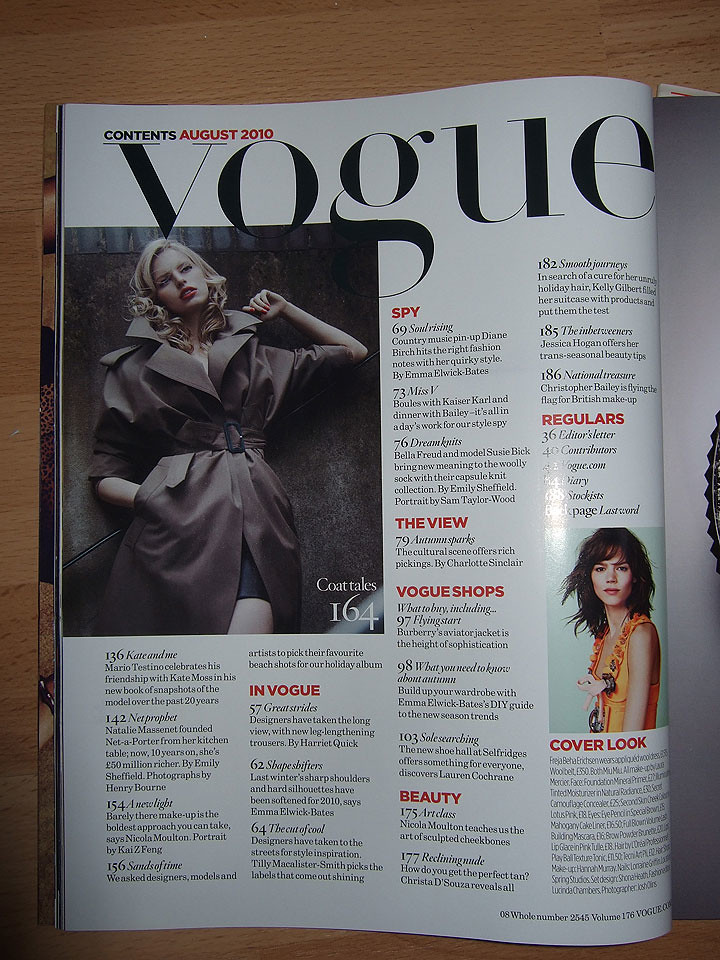
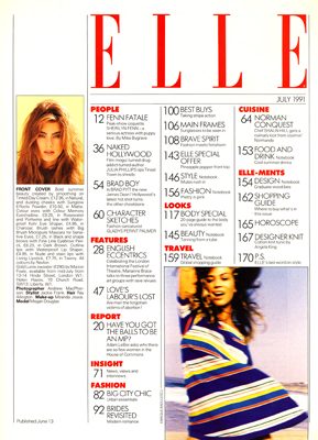